
|
A Complexity-Scope for the Butterfly EffectMay's Equation and Spreadsheet Graphing |
|
|
|
A Complexity-Scope for the Butterfly EffectMay's Equation and Spreadsheet Graphing |
|
 |
As a basic common example, take driving a car, notably one with its wheels out of alignment. Driven at slow speeds, we may not even notice a hidden shaking problem. However, press on the gas pedal, put more energy into the system, and the unpredictable swerving, the crazy shaking, appears and increases, perhaps dramatically enough to end the car's function. It turns out that these sometimes hidden mis-alignments are everywhere, and equally surprising is not only how well life has adapted to dealing with them, but how important they are to the health of living systems and thinking.
To seek a deeper dive into this slippery and somewhat hidden nature of the universe, mess around with something like a microscope, one that will be called here a complexity-scope. The temptation from this sentence onward is to keep reading. That is course useful, yet insufficient; just reading is missing the boat. The point is to set you up to actually experience something, a couple of somethings actually, both some of the magic of the universe and the magic of one of the earliest and still one of the most important of the digital literacies, a spreadsheet. This will involve some very basic math, a very simple formula and learning/using some spreadsheet skills. The complexity-scope, like other types of scopes, makes it possible to zoom in and out on the action, to see that a single system can have an amazing range of behaviors hiding inside itself. The butterfly effect, a tiny localized change cascading onward to large global impact, is just one of those hidden behaviors. Any of these behaviors could be seen as the long term "average or typical" behavior of the system depending on how long and what data is collected. In fact it all depends on a key variable or even numerous variables. In the case of this simple example, there will be but one condition that changes. But, in exploring the range of those changes, surprising results appear.
To build a complexity-scope from scratch is to better understand it. A spreadsheet will use May's logistics equation - LET X = R X (1-X) to quickly make a graph of 75 or so data points. The following steps below also complete a review of the technical procedure of setting absolute values in formulas and copying formulas in spreadsheets. You will also discover how to move the graphs/charts that you create into your own web pages. But most importantly you are also preparing yourself to reflect on some of the most stunning achievements in the scientific thinking of the twentieth century. For those who are educators, we will take this line of thinking one step further. Does this new line of thinking challenge the assumptions we make in educational settings, for example, when we average student grades?
This story begins with a problem in biology. The biologist
Robert May needed a way to mathematically model the nonlinear relationship
between two predator-prey species, the lynx and the hare (rabbit). That
is, a season with a large number of lynx will produce another year with
a lower number of lynx because they ate a large portion of the rabbits
in the previous year. This in turn will lead to a year with a smaller number
of lynx which will allow the rabbit population to climb again. The actual
data showed greater variation than the data created by the mathematical
models in use at that time. May went looking for other ways to express
this situation, and in so doing stumbled into unexpected behaviors.
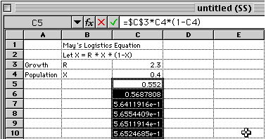 |
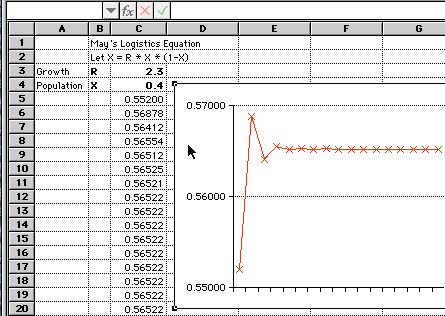
If the number of hare in the ecosystem is large one year, there can be a larger number of lynx which prey on the hare during the next year. In a more general way, this is a mathematical model of two variables which can interact with each other. The spreadsheet is used to carry out repeated application of this mathematical relationship. In the above spreadsheet example, some the numbers may appear in scientific notation. The spreadsheet can be directed to display a limited number of decimal places which make the numbers more readable.
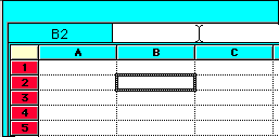
Open a spreadsheet application on your computer such as Excel, Google Sheets, Numbers or LibreOffice Calc (free, open source). The directions that follow are based on Excel but the basic ideas work in all spreadsheets. See the picture below for guidelines on where to put your data in the first four rows. To create such a spreadsheet for yourself, start with the initial value of R (rate of growth constant) at 2.3 and the initial value of X (initial population) at 0.4. Once the rest of your spreadsheet is set up, try changing the initial value of R between 1.0 and 4.0 and watch the changes ripple down the numbers. Depending on the location of your numbers, the initial formula could look like this =$C$3*C4*(1-C4). Note the dollar sign symbols ($) to keep the cell containing R the same in each formula. The value of R becomes an "absolute" value while the others become "relative" values when the formula is copied. Click on the cell with the needed formula and drag downward across cells. Replicate this second cell downward for about 75 more cells. Once the cells are selected by the click and drag process:
Video Instruction
Optimized for those with slow Net access, so smaller files but lower quality video
- Setting Up and Doing the Calculations. Part I., about 2 minutes
If these movies do not play, download and install the latest version of Windows Media Player.
If the formula display is turned on as in the image below, the column
of formulas would look like this:
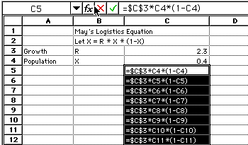 |
To display formulas all across a spreadsheet as above:
 |
Video Instruction
Optimized for dial-up modem speeds so smaller files but lower quality video
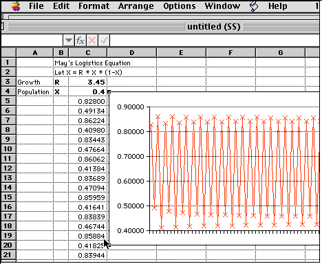 |
Once again change the initial value of R between 1.0 and 4.0 and watch the changes ripple across the graph. Note the immediate changes in the chart as you make changes to the initial value of R. It may also be interesting to change the initial value of X. There are many interesting experiments one can conduct with this spreadsheet. How many decimal points out in the values of R or X can the change of one number cause the system to dramatically shift its behavior? Observers of such analysis conclude that: "Nonlinear systems (e.g., chaotic systems) do diverge exponentially with time." What values of R must be reached for this conclusion to be observable?
One approach is to capture the image of your entire desktop and edit that image down to the portion you want in an image editing application such as Windows Paint or Photoshop. Further, you could use an image converter downloaded from a shareware web site. On a Mac, such a image converter is called Graphic Converter or GIF Converter or on a Windows computer, Paint or PhotoEditor. It is used to open the file with the image of the desktop, crop it to the needed size and save it to a web format. On a Mac, simultaneously press these keys to make an image file out of your current computer screen: Shift; Apple; CTRL and 4. A cross-hair cursor appears for selecting any rectangle of the screen, which then moves the copied section to the clipboard. On a Windows computer, resize the window as needed, then press these keys: ALT and Printscreen. On a Mac paste the clipboard into GIF Converter (or other image editors). On a Windows computer, paste the clipboard into Paint. Save your files and any further editing as GIF or JPEG formats which are image standards in Web browsers. GIF is the best format for spreadsheet charts and graphs. The GIF file must then be moved to your web site and a picture link made to it from the relevant web page. This technique was used for the images in this web page.
The second and easiest technique is to simply save your spreadsheet as an HTML file. This works with the most recent versions of Excel and other spreadsheet applications. If File in the menu bar look for a Save As Web Page command. If not, use the Save As command, then look for options under the file name area to save the spreadsheet in HTML format. The web page with your spreadsheet data that you have created is then saved as a separate file with an accompanying folder by a similar name that holds any image or images that were in your spreadsheet. Your graphs will automatically become GIF files. This has the added advantage of including the text of the spreadsheet cells in the web page, instead of just the graph. Make your link to the HTML file but move both the file and the related folder of images to your web server account space. Some older versions of SeaMonkey and Internet Explorer may not display the web data and graphs correctly. If there are problems, use a different or newer web browser. Details will vary with the software programs that you use.
For a closer look at the actual procedure of inserting images in web pages, look at the HTML source code for this web page. If you are not comfortable working in HTML source code, remember that the browser SeaMonkey has a web editor built in to it called Composer. To be able to see the image editor button while looking at the contents of this web page, click on File in the menu bar and drag to Edit Page. In SeaMonkey Composer's tool bar is a symbol with with a tiny square, triangle and diamond in it which is the button for inserting images. A click of that button leads to a request for a file name. Type in the file name of the image that is needed. Your image will appear where ever the cursor was last placed when you used the image editor button.
Just how delicate and complex are the relationships between the numbers in nonlinear systems such as that demonstrated by May's Equation? Using other mathematical models, scientists have observed that even with an initial value measured to the 12th decimal place a system can demonstrate chaotic behavior after only fifty iterations of the model. Others recorded such behavior with values to the 31st decimal place after only one hundred iterations of the model. To better grasp the delicate nature of such measurement consider that there are approximately 300,000 atoms in the thickness of a piece of paper. Atoms are measured in the 1 to 6 angstrom range with 1.00 angstrom being equal to 1X10 ^ -10 meters. An average atom (3 angstroms) might be measured at 0.00000003 centimeters (cm) which takes this number out to eight decimal places as compared with the computer formulas use of a 31st place decimal place number. In other words, measurements many times more precise than the width of an atom are insufficient to predict the long term behavior of important states of various nonlinear systems. Sensitive dependence on initial conditions, often referred to as the butterfly effect, is a defining property of chaos in dynamical systems theory.
Scientists
reason from this mathematics that the flap of a single butterfly's wing over a
Wisconsin prairie may be the initial puff in a chain of interactions around the
world that months later turns into a monsoon in India. Sometimes called the
"butterfly effect", the butterfly is often used as the icon or symbol for
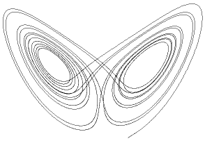
nonlinear systems. There is a second reason for the butterfly icon. The graph on
the left is not derived from May's equations but from another pioneer in
exploring nonlinear understandings. The graph that looks somewhat like a pair of
butterfly wings was derived from Lorenz's famous equations modeling major
elements in the behavior of weather. The conclusions were the same. Nonlinear
systems diverge exponentially over time. Long term prediction was not possible.
As a human mind is at least as interactive and complex as weather systems, applying nonlinear understanding to education is a reasonable next step. Participants are also part of the highly interactive human culture which is in turn made up of the interaction of billions of minds. The movie titled The Butterfly Effect explored this line of possibilities with numerous examples of how tiny changes in a situation can result in great differences over time. How do we apply this knowledge to educational systems?
One implication is that the gentlest actions of individuals can be seen as equally powerful in the long term as a single butterfly's, though we will never know which of our actions is responsible for what. The tiniest smile or pat on the back or frown from an educator may profoundly change human outcomes at some more distant date.
Because of the nature of nonlinearity and our human incapacity to completely measure, ". . .in the systems that are important to education in specific and culture in general, fundamental belief in long term prediction is not logical and short term prediction must remain under close scrutiny" (Houghton, 1989). Another interesting and counter-intuitive by-product of these observations of nonlinearity in biological and social systems is that "repetitive and thereby predictable behavior has been seen as a sign of low quality or ill health" (Houghton, 1989) while unpredictable behavior is seen as healthy. Such thinking runs counter to the norms of educational research and as well as classroom behavior.
What if May's mathematical model represented nonlinear relationships in education? What about the relationship between the energy students and teachers put into their interaction with each other or the pattern of their interaction with thecurriculum yielding the by-product of their grades (the outcome of the quality of their assignments)? Can you think of others?
If students have a high number of high
grades and a high number of low grades, our current technique of grade averaging would
lead us to conclude that they are truly average C students.
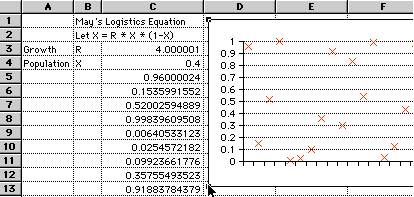 |
In the above graph, the growth rate is pushed even higher, close to 4.0. Now the numbers appear to be dispersed randomly. Here the graph might be used to represent students with a high rate of learning. If this number is pushed even slightly higher the variations become so extreme that the spreadsheet may crash or refuse the calculation after a couple of steps.
This mathematical model of high rates of interaction has interesting implications when applied to educational settings. Instead of consistently high scores, we see extremes in highs and lows, yet some in the middle. Grade averaging of these numbers would report their grade as in the middle, or generate the label, "average or C student." Is the pattern in the graph above the score of a truly average student or is this scientifically normal behavior for high energy achievers? Without reporting range and frequency do we not grossly distort our perceptions of human beings? If an average is a gross misrepresentation of a person's work, is the concept of a single numerical average as applied to evaluating humans an immoral act?
The method by which a single exam grade becomes an element in that average is also worth investigating. A high percentage of school grades depends on the multiple choice question. Some have argued that the multiple choice test has "fostered a school-based culture of rote memorization that has little to do with true learning" (Cohen & Rosenzweig, 2006). A multiple choice question requires the test-taker to do a "Google search" of their brain, an act of recall. If in real life they can get the answer by doing a real search of Google, is there not a higher level use of human intelligence that would be better to engage? Is the problem of averaging grades further compounded by the weakness of multiple choice tests in measuring higher order thinking or intelligence?
Thomas Edison claimed that it took him hundreds of failures to get his first successful light bulb to work for mere hours. If we averaged his thousands of attempts with one successful one, Edison would receive a failing grade. Would this not be the case for almost all creative and inventive activity? Social and business entrepreneurs seldom get it right on the first plan. Yet we know that it takes considerable confidence and encouragement to persist in challenging settings. Could the very nature of averaging be a cause of increasingly poor performance for some over many years of its application? For others might the psychological impact of averaging be a factor in unwillingness to take risks, depressing the chance of significant human achievement? Are we measuring and reporting on the right things? Given the high rate of change in our growing digital culture and the increasing great need for problem solving, creativity and invention, what would be a better system of communicating progress and achievement than averaging? Would the concept of a portfolio a better way to report and judge the range and frequency of human learning? What might be other alternatives?
These spreadsheet graphs and their nonlinearity will not provide us answers to such questions. But they do provide an example of the use of spreadsheets and mathematical reasoning to provoke important discussions. Such dialog is about the relevance of our most basic presumptions in how education and the world works or in how it should work. Computers do not reach such conclusions for us, but without computers we would not have magnified human reasoning to the point where we could see important consequences of our actions and thinking.
For us, computers have become a wide variety of complexity-scopes expanding our knowledge in similar manner to microscopes and telescopes. Our access to such complexity-scopes is very recent in human history. The conceptual discoveries that served as the basis for the field of nonlinear dynamics or complexity theory did not even occur until the availability of the early calculators and computers of the 1960's. But such tools are now commonly available to those who understand what they hold when in possession of a spreadsheet. Further, as you have completed the activities earlier in this essay you are now the owner of one type of complexity-scope.
Such vast mathematical power has made it common to anthropomorphize and glorify the technology and degrade human self-perception (Turkle, 1984). Educators especially must not confuse or equate the computer's power to calculate with the human power of thought. High technology does not derive its power through the computer's capacity to "think." Instead, technology derives its value from the capacity of humans to extend and transform their thinking through the power of computers, to enable others to see that activity as simple and gentle as that of a butterfly can effect the future in profound ways. Just as a microscope or a telescope magnifies what we can see, the mathematical power of the computer that serves as complexity-scope magnifies the power of human thought.
Collins, Ben (June 8, 2022). Exploring Population Growth And Chaos Theory With The Logistic Map, In Google Sheets. https://www.benlcollins.com/spreadsheets/logistic-map/
Cross, Michael (2001). The Butterfly Effect. Available February 27, 2001 at http://www.cmp.caltech.edu/%7Emcc/chaos_new/Lorenz.html
Delaney, Robert (2005). Dynamic Spreadsheets for Use in Algebra, Geometry, and Calculus. Available February 2, 2005 at http://math.bu.edu/people/bob/spreads/
Houghton, Robert S. (1989). A Chaotic Paradigm: An Alternative World View of the Foundations of Educational Inquiry. Available October 31, 1994 at http://digiacademy.org/ThesisM/chaosthesis.html
May, R. (1974). Biological populations with nonoverlapping generations: stable points, stable cycles, and chaos. Science, 186, 645-47.
May, R. M. (1986). When two and two do not make four: nonlinear phenomena in ecology: The Croonian Lecture, 1985. Proceedings of the Royal Society of London series B, 228, 241-266.
Tuck, E. O. & de Mestre, N. J. (1991). Computer ecology and chaos: An introduction to mathematical computing. Chesire, Melbourne: Longman.
Turkle, Sherry (1984). The Second Self: Computers and the Human Spirit. New York: Simon & Schuster.
Further information on nonlinearity and self-adaptive complexity and its relationship to education is also available.
Address of this Web Page: http://digiacademy.org/EDELCompEduc/Themes/Spreadsheets/MaysEquation.html
Spreadsheets | Page Author -RS Houghton