 |
|
This page provides essential information about desktop publishing. It
provides a tutorial on using "fast-publish" desktop
publishing templates and on tutorials teaching basic image editing for the capture and manipulation of images
that go in newsletters, digital slideshows, web sites and many other applications. In depth guidelines for composition
and design and reference to the large array of facilities and technologies
available are also provided. The page also lists the current North Carolina
instructional objectives that lead to integrating desktop publishing into
K-8 school curriculum. A bibliography lists further resources both on the
web and on book shelves. These skills are also the foundation for "webtop" publishing
on the Internet.
 Computer systems support publishing in a number of ways
but when the ideas are shared on paper we sometimes use the term desktop
publishing and often confuse this term with the concept of word processing. Desktop publishing historically has meant organizing previously composed images and text together
for display on a piece of paper, whether for newsletter or book. This would
be a likely definition on a state technology exam. This distinguishes such
work from simple word processing which is generally thought of as a text
only process. However, most composers know that word processors now
include many features that were once reserved for desktop publishing software.
Often the document is never seen on paper, just a shared file on a computer screen. Further,
web pages are increasingly not just a replacement for print publishing but an advancement over it. Typical of the cyberspace
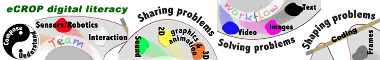
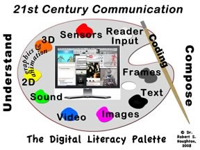
age, the definitions keep evolving. The 21st century has brought the inclusion of the entire digital palette to the concept of a page.
Computer systems support publishing in a number of ways
but when the ideas are shared on paper we sometimes use the term desktop
publishing and often confuse this term with the concept of word processing. Desktop publishing historically has meant organizing previously composed images and text together
for display on a piece of paper, whether for newsletter or book. This would
be a likely definition on a state technology exam. This distinguishes such
work from simple word processing which is generally thought of as a text
only process. However, most composers know that word processors now
include many features that were once reserved for desktop publishing software.
Often the document is never seen on paper, just a shared file on a computer screen. Further,
web pages are increasingly not just a replacement for print publishing but an advancement over it. Typical of the cyberspace
age, the definitions keep evolving. The 21st century has brought the inclusion of the entire digital palette to the concept of a page.
In the inline frame below are thousands of images associated with desktop publishing (DTP). In this live search below of Google's image database for the term "DTP," notice the wide variety of meanings of this term found within these images. By clicking these images, the reader can follow up these leads and gain greater depth in understanding this concept. The reader can extend this activity further by clicking within Google's input box and typing other related terms, for example: desktop publishing, brochure, design.
As these Googled images imply, a central issue in desktop publishing can be summarized in one word: design. Our students have been placing elements in patterns from early childhood, from wooden blocks to collages of cutouts. Desktop publishing provides us an opportunity to ask them to think more formally about those patterns and their designs. Teachers can begin by asking students to think about daily and common design decisions. The setting of the table for the evening meal can be set "nice" or sloppy, roomy or crowded. The pattern of the table setting changes to fit the content of the meal and the special nature of the occasion. This event can help writers see that a printed page is like a table and instead of silverware and tableware elements, we use images, blocks of text and empty space to create not only pleasing design but a more functional arrangement as well. Just as a table setting makes the meal taste better and proceed more efficiently, so thoughtful page design may not only make its reading more pleasant, but can effect whether it is read or even understood. Many of the design guidelines for merging text and images are the same for both the printed page, digital slideshows and Web pages, but there are also important differences.
Once computer technology became powerful enough, why did desktop publishing rocket into widespread public use in the 1980s? One must be able to imagine a time before personal computers with a busy industrial economy that had a enormous need for large numbers of copies for documents (brochures, flyers, magazines, newspapers, etc.) that included one or more images.
Finding a better way to typeset text, include images and produce a number of copies has led through thousands of years of creativity and re-invention. 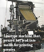 The advances from cuneiform wedges began with rollers pressing symbols onto clay tablets. It evolved from chiseling wood blocks, to the noisy, hot, smelly and often dangerous rooms of the industrial machinery of the printing press and moveable type, to linotype machines and later to offset printing (e.g., offset lithography). These were processes which were much more expensive and more time consuming than using the typewriter. Adding color images drove the price of reproduction up even higher. Just prior to personal computers, the choices included a typewriter, a graphic layout artist, Xerox type copy machines and/or a printing press. For those with typerwriters, layout and duplication meant typing and drawing on messy and time consuming carbon paper. A last vestige of carbon paper thinking is the concept behind the letters CC for "carbon copy" that are available within every email composition.
The computer age provided an important contrast to the complexity, the efficiency and expense of prior technology. Not only the could entire printing process be placed on one desktop with a computer and desktop printer, but the entire composition process from its creation to multi-copy sharing was included as well. In 1994, the Internet and World Wide Web browser software simplified the very final step, the global distribution of an infinite number of color enhanced copies of image and text whenever a copy was needed. By the start of 21st century, all the other known media had followed the lead of images and also become partners with text with a page on the Web.
The history of desktop publishing began with the introduction of low-cost laser printers which provided the first high quality output competitive with the printing presses of the day. The first laser printers were built by Canon and marketed in 1983. A series of other developments quickly followed. Today desktop publishing software is as common as spreadsheet and database software. Desktop publishing features are incorporated into standard word processors and the same software generally has options to convert what once went to paper into Web pages ready for uploading to Web sites.
Hewlett-Packard produced the HP LaserJet in 1984, and in that same year Apple Computer introduced the first Macintosh. Adobe introduced PostScript page description language (PDL) for printers in 1985. In the same year Aldus developed a software application for the Macintosh computer focused on desktop publishing called PageMaker which revolutionized the production and publishing process. Adobe later bought the PageMaker application, which has been replaced by newer software in the market such as InDesign, Quark Express and Microsoft Publisher. Also in 1984 a company called Forethought developed an application for the Macintosh computer called Presentation, that was later renamed Powerpoint and then bought by Microsoft in 1987. Both Pagemaker for paper displays and Powerpoint for computer displays excelled in integrating images and text side-by-side in the same display.
Optional Supplementary Reading
These five elements provides some guidelines for how to move the puzzle pieces of text, image and white space in the frame of a page. An important next step is to learn language more specific to DTP.
Jacci Bear's work on the elements and principles of graphic design is a good next step beyond the general ideas presented here. She adds to Lichty's ideas by including the DTP concepts of line, mass, shape, texture and color.
Many patterns are possible. Through experimenting, the one design that is generally better will emerge. For more in-depth information, select an information source from the bibliography at the bottom of this page.
The first edit of an image really begins with the mind's eye, with a border or frame and a concept for filling it. With a camera or image recording or drawing system. Where and how you or someone pointed the camera acted as a kind of image scissors that cut the image from its initial scene or context. The use of the paint brush or pencil to draw on a computer screen or canvas is just another way to frame and complete an image. Once an image is designed or captured or captured by camera in some way, once the first cut is made, the computer provides important additional tools for further image manipulation and the placement of images within other media such as slides and pages (essays or books).Integrating the Image Means Reading the Image
When we choose to use an image or images in a mixed or more comprehensive composition, their use and placement must be done with thoughtfulness and care. The use of an image needs just as precise a placement and a selection as the words in a sentence. Think of the image as a visual word. From years of instruction in composition, we know it is best to choose our "words" with our audience in mind. Why do we use a certain image? Effective image use depends on knowing what images will be "readable" or understandable by those receiving them. Effective use means finding an image that contributes to making our point, to saying what we want to say. In some cases the visual image may be the only "word" on the page or screen and must do all the work. In some cases the image may have just one word or one sentence with it. This is common with our early reader books and advertising to all ages. Many popular publications using paper and web pages today share the space for communication in such a way that images claim almost as much space as text, and sometimes more.The reading teacher and the composition teacher share in the teaching of many important ideas. The composer of an image or the composer of a larger composition that integrates images with other media such as text needs to ask the same questions of their work as the readers of the work should be asking. How strong is the relationship between the image, the text and other media in this composition? "Is this image in its original state (i.e., no manipulation or "doctoring")? Why are we looking at this? What is the main idea behind this image? What motivates the creator here? If this image was altered, who did it and why? How did the original artist expect this image to be read (e.g., as an interpretation, a prediction, a documentary)? (Burke, 2001) Burke's extensive list of other potential questions for reading an image is available at his web site.
Shlain (1999) takes the issue of image integration one interesting conceptual step further. He sees the role of images and the role of text in a tug of war for influence of the mind, with text speaking to the linear and abstract left hemisphere of the brain (in his opinion, the more masculine side) and the image speaking to the holistic and visually oriented right hemisphere (in his opinion the more feminine side). Though his provocative thesis is not widely accepted, it does help us to understand the depth of the challenge in creating a harmonious composition where all the media elements support each other. His writing has caused me to think of the multimedia elements of a composition (e.g., images, text, videoclips, sound, etc.) as members of a family. Just as with the members of a human family, the dynamics of the interactions can lead to dysfunctional families that can fail in their mission to sustain each other and thereby cause each to fail. The interactions of the members can also lead to functional families that not only increase the effectiveness and value of each other, but make a larger contribution to the concerns of the world around them. Harmony is an ancient concept but no less relevant in the complexities of composition in our emerging digital world.
Design and Image Composition
Once these initial decisions are made about integrating the image, other issues can be considered that can make or break the communication power of the image. A multitude of books are available on the topic of conceptualizing and planning for visual communication so check with your favorite library and the bibliography at the end of this page. Shorter web based treatments are provided here including the rule of thirds and other design ideas.The "Rule of Thirds" is a guide for the placement of elements in an image. It is a simplied version of the golden section (see great pictures illustrating this concept) or golden ratio. (Readers with greater depth in mathematics will appreciate exploring additional history on Phi, or 1.618). Viewing images based on the Golden section will help establish the idea.
The rule of thirds has the placement of key elements of an image at the intersection of thirds in the image frame. This is easier for the eye to imagine and work with than the actual golden section grid. Here are excellent but short treatments on this simple guideline to more effective shooting and cropping of images.
There are many other design elements to consider in image composition. However, there is no one right way to approach or to precisely describe the mental frame of reference that raises the quality of image work. The many ideas that emerge here from these resources should also be carried into video composition.
- Rule of Thirds by Digital Photography Schools.
- Rule of Thirds by Anthony Cody, Middle School Teacher, Oakland, California.
- Rule of Thirds by Silverlight.
- Rule of Thirds by wikipedia.org
- Rule of Thirds Google Search
- Beginnings of Photographic Composition by Kodak.
- Top 10 Photographic Fundamentals by Bluebird Meadows.
- Beginner's Guide to Digital Photography, by Anthony Cody, Middle School Teacher, Oakland, California.
Once an image is captured by camera or drawn by hand, it often needs to be changed or edited further. This is done for several reasons. It may be that the initial image capture was poorly composed. It may also be necessary in order to fit the image into its display space and/or to remove distracting and irrelevant parts. For web use, it is also extremely important that the file size of the image be cropped and/or scaled to keep the image at the absolute smallest size possible yet still get across its message. Smaller image file sizes are important in making a Web page load and display quickly. Paint (Win), iPhoto (Mac) and Pixlr (online editor that is cross-platform) can each carry out the basic image editing procedures of scaling, cropping and reformatting. The classroom exercises will focus on the use of the Pixlr image composition tool.
Pixlr (online, cross platform image creating and editing service)
Any computer can run this online free application from Pixlr.com without downloading or installing anything. It comes in two versions. PIxlr Express waits for the uploading of an existing image. Pixlr Editor enables the drawing by hand of a new image, with object-oriented objects that can be moved as well as allowing drawing on multiple transparent layers.
- Resolution or Image Quality. Use the File/Save command to change resolution or quality of the image resolution. If choosing jpeg format then use the slider to lower or raise image resolution.
- Scaling. click Image in the menu bar and select Image Size, then choose new size numbers.
Cropping To crop, click Image in the menu bar and select the Crop command or look for this symbol in the tool bar. Similar versions of this symbol are used by many graphic or image editors. This includes the image editing features in Microsoft Office, such as Powerpoint, Word, and Publisher.
- Re-formatting. Use the File/Export command to put the file in different file formats.
Paint (Windows OS)
The Microsoft Paint program is on every Microsoft Windows computer as part of the operating system. Paint is first of all a tool for drawing images, though drawing with a mouse is a challenge. Paint's strength is that it is very simple, but the basic image editing operatings require more clicks than iPhoto or Pixlr.
- Scaling or Resizing.
- a Paint Tutorial on scaling 1:18 ms; 930k (Win).
- This means that the entire image is kept in view but reduced to a smaller size. This generally reduces image quality but also makes the image take up less storage space and transmit faster.
- Cropping.
- Paint Tutorial on cropping 1:14 ms; 862k (Win).
- This means to take or capture some portion of the image, erasing or cutting away the rest. Cropping is often done to improve the image composition based on the conceptual issues discussed above or to make an image better fit into its display space. For web work, cropping has the advantage of making the image take up less storage space and therefore will transmit more quickly across the Internet.
- Re-formatting.
- Paint Tutorial on reformating 35ms; 408k (Win).
- This means to change an image format from one type to another. For example, your paint or draw program may save files in common formats for your operating system, PICT (Macintosh) or BMP (Windows) but these formats are not used by Web browsers which use JPEG (JPG), GIF or PNG. These web formats also automatically compress the file size of the image to allow faster Internet transmission. GIF is used for line art and solid colors. JPG is used for photographs and other images with continuously changing shades of color.
- Reducing image resolution.
- Paint Tutorial on reducing image resolution to reduce file size 52 ms; 596k (Win).
- Reducing resolution does shrink file size but lowers image quality. This can be done in several ways. One example would be moving an image with millions of colors to a grey scale image. Another example would be changing the image to only 256 colors. Reducing resolution can also be achieved by using a higher level of compression when saving photographs as jpeg files.
iPhoto (Mac)
The iPhoto application is on every Macintosh computer as part of Mac's iLife package.
Adobe Illustrator is on all the Macintosh computers used in our electronic classroom. It provides a number of ways to address scaling, cropping, re-formatting and reducing image resolution. It is a excellent, powerful and expensive application taught in courses at WCU. It is used by graphic and design professionals employed around the world. WCU provides extensive online training movies on how to use it at onlinetraining.wcu.edu.
There are a number of other ways to create, capture, draw or copy an image (clipart, Web image databases, video, TV, scanners, still and video cameras, snapshots of computer screens, pressure sensitive drawing tablets). There are also number of other online Web applications for image composition and editing.
Images can be copied from any web page, but this raises numerous copyright issues. Make sure you know the law. Copyright in an Electronic Environment (North Carolina Department of Public Instruction) is a informative review of what is possible to legally copy and what is not.
File size is very different from display size. Both are important and both scaling and cropping are use to change both. File size refers to how much space an image takes up on a disk or hard drive. To make this file size measurement, simply look at the file size when the operating system lists the contents of a disk or folder. This sometimes requires using the View command in the menu bar to activate the feature that shows file size.
Keeping image and other file sizes "light" is necessary because many homes in the United States and the world will be using 56kb modems for many years and at this speed, images on a web page that are too numerous and/or too large can make the display of a web page too slow. When the display is too slow, users tend to stop the display and move on, never seeing and reading the composition on which so much time was spent.
Display size refers to how many inches, centimeters or pixels an image is tall and wide. There are commands that can make an image appear small in a web page which do not reduce the size of the file. That is, making an image just appear smaller will not speed up the display of the image and its web page. The measurement is usually given in pixels and requires special software applications that report such information. Pixels are the tiny dots that make up a computer screen. Netscape Composer uses standard HTML commands that will compress an image to fit into a certain vertical and horizontal space measured in pixels, but this approach does not reduce file size and speed up web page display. As a rule, this "shrink it" approach to controlling display size should not be used in favor of solving this problem using other applications. Several other software programs beside the basic Microsoft Paint application are available that can do these basic image editing features and more. This includes most programs with Paint or Draw in the title. As examples, all of these features can be found in these commercial programs: Appleworks 6.0, Paint, Microsoft Publisher and Adobe Illustrator and Photshop.
There are also freeware and shareware programs that do these jobs. Every teacher should have a couple of such programs for both the Mac and Win platforms to load on school and home computers. It may be useful for you to go to these web sites and download and copy to your disks the applications you need. However, online image editors (especially those that are free) are increasingly as powerful in comparison.
Being empowered to make image changes also commonly includes learning these four digital skills in any image editor: scaling, cropping, re-formatting and reducing image resolution. Resources for learning how these are done in four different applications are provided below: Paint (Win), iPhoto (Mac), Pixlr (cross-platform online) and Illustrator (cross-platform). The hands-on classroom instruction will focus on Pixlr because there is no cost for any teacher or student to use it at school or at home if there is an Internet connection, instruction across all types of computers is identical and because it is very good.
There are two critical features that distinguish this software from basic-text word processors:
- Page Layout (the ability to place different fonts of text and image objects on the same page without being forced into continuous columns)
- Image/Graphics Control (features that allow the user to resize, rotate, crop and otherwise shape an image)
Examples of desktop publishing output are as near as any magazine, brochure, book and current product documentation. Many companies advertise their services and give examples of exemplary work on the web.It is now routine in professional publishing for even one page to contain a complex mix of main story text and sidebar text with a related story. Within this text will be a range of artwork, photographs, and graphs and charts.
A multitude of other features are discussed in the software reviews section below.
Current Reviews
There is a larger criticism related to the DTP concept of balance that is perhaps more instructive. All technologies have features that can be used to extremes. Perhaps the most biting critique that one can make of desktop publishing is the way that overall design fails when graphics, images and other features effectively catch attention yet obscure or become out of balance with the quality of the text content that they accompany. That is, design also fails when more attention is given to looks than to substance. The most effective composers give proper attention to both. This inline frame page below from hypocrisytoday.com/dtp.htm effectively makes this point. For reviews of specific desktop publishing applications, try these Google search that will appear in the inline frame below. Right click the links within the search to pop them out in their own display window or right click the immediate links below.
Once an image is created, what will be done with it? Hang it on a wall or merge is with a more comprehensive composition? Some applications that facilitate merging images and text provide a "fast-publish" design assistant, wizard or procedure. That is, these programs provide a basic template for further modification. However, some additional skills generally have to be learned to use the template system effectively. Tutorials are provided for selected applications commonly found in schools.
Applications more typically used K-8
- Microsoft Powerpoint - WCU's online training tutorials (WCU)
- Google Docs - Online training for Presentation (Google)
- Microsoft Publisher - Training and Tutorials (About.com); WCU's online training tutorials (WCU). Click to download a 7 page tutorial (Word document) on how to use Microsoft Publisher to make a newsletter: Microsoft site; or local site.
- Microsoft Word - Training and Tutorials (About.com); WCU's online training tutorials (WCU)
- Other Training Resources (About.com)
Applications more typically used with High School newspapers
- Quark Express - Training and Tutorials (About.com)
- Adobe Pagemaker Training and Tutorials ; not being updated but still in use (About.com)
- Adobe InDesign - Tutorials (About.com)
Simpler desktop publishing assignments will require students to create brochures, newsletters or even product documentation for different school processes or equipment that other students and teacher use. More sophisticated and involved work could incorporate school newspapers and yearbooks.
Relevant North Carolina K-12 Computer/Technology Skills
Goal 2. The learner will demonstrate knowledge and skills in the use
of computer and other technologies.
Goal 3. The learner will use a variety of technologies to access, analyze,
interpret, synthesize, apply, and communicate information.
2.4 Edit a word processing file to make indicated corrections. (KU/WP/DTP)
3.1 Create, format, save, and print a word processed document. (KU/WP/DTP)
4th Grade Lesson plan examples
North Carolina regional travel brochure (grade 4 English Language Arts and Social Studies) By Deborah Harrell. "The students will cooperatively design travel brochures that describe major physical and cultural characteristics of the regions in North Carolina" (LearnNC).
Kid-created biographies (grade 3–4 Computer/Technology Skills, English Language Arts, and Information Skills) By Gregg Farr, Lynn Beatty, and Tricia Freeze. "In this lesson plan, the students will create biographies on the people they know best-- their teachers! The students will use various skills to collect information, organize details, publish the biographies and present the information" (LearnNC).
2.4 Use a word processing application to create and format a document. (KU/WP/DTP)
3.2 Use word processing/desktop publishing applications to create documents related to content areas. (KU/WP/DTP)
6th Grade Lesson plan examples
Integrated unit on South America (grade 6 Computer/Technology Skills, English Language Development, Mathematics, and Social Studies) By DPI Integration Strategies. "This lesson includes information concerning database operations, word processing, desktop publishing, and spreadsheet formatting. Students will solve math problems" (LearnNC).
3.2 Use word processing/desktop publishing for assignments/projects. (KU/WP/DTP)
3.3 Research, create, publish, and present projects related to content areas using a variety of technological tools. (KU/WP/DTP/DB/SS/MM/T)
3.2 Use word processing/desktop publishing for assignments/projects. (KU/WP/DTP))
3.3 Research, create, publish, and present projects related to content areas using a variety of technological tools. (KU/WP/DTP/DB/SS/MM/T)
8th Grade Lesson plan examples
Civil War journals. (grade 8 English Language Arts and Social Studies) By Gwen A. Jones. "Integrates creative writing with social studies and enhances knowledge of the effects of the Civil War on people" (LearnNC).
Shelves
Concept
Barry, Ann Marieseward (1997). Visual Intelligence : Perception, Image, and Manipulation in Visual Communication. State University of New York Press.Berger, Arthur Asa (1998). Seeing Is Believing : An Introduction to Visual Communication. Mayfield Publishing Company.
Burke, Jim (2001). Illuminating Texts : How to Teach Students to Read the World. Heinemann. [Author's web site and his web companion to text]
Elkins, James (1999). The Domain of Images. Cornell University Press.
Finnegan, Ruth H. (1988). Literacy and orality: studies in the technology of communication. Oxford, UK ; New York, NY, USA: Blackwell.
Kress, Gunther R. , Van Leeuwen, Theo Gress, Gunther R. (1995). Reading Images: The Grammar of Visual Design. Routledge. [web essay on this book]
Messaris, Paul (1994). Visual 'Literacy' : Image, Mind, and Reality. Westview Press.
Schapiro, Meyer (1996) Words, Script, and Pictures : Semiotics of Visual Language. George Braziller Publisher.
Scholes, Robert (1989) Literary Criticism. Yale University Press. [Reviews]
Shlain, Leonard. (1998). The Alphabet versus the Goddess: The Conflict between Word and Image. Viking. [Booklist Review.]
Snyder, Ilana (Editor), Michael Joyce (Editor) (1998). Page to Screen: Taking Literacy into the Electronic Era. Routledge.
Shlain, Leonard (1999). The Alphabet Versus the Goddess: The Conflict Between Word and Image. Arkana; ISBN: 0140196013
Stephens, Mitchell (1998) The Rise of the Image the Fall of the Word. Oxford University Press. [Booklist Review.]
Technique
Hinderlitter, Hal (2000). The GATF guide to desktop publishing. Pittsbusrgh, Pa. : Graphic Arts Technical Foundation. [WCU]
Lichty, Tom. (1994). Design principles for desktop publishers, 2nd ed. Belmont, Calif. : Wadsworth Pub. Co. [xiv, 226 p. : ill. ; 24 cm. WCU GENERAL Z253.53 .L53 1994]
Parker, Roger C. (1993). Looking good in print : a guide to basic design for desktop publishing, 3rd ed. Chapel Hill, NC : Ventana Press. [xxxiv, 423 p. : ill. ; 24 cm. The Ventana Press Looking Good series. WCU GENERAL Z253.53 .P37 1993.]
Bivins, Thomas. (1992). Fundamentals of successful newsletters : everything you need to write, design, and publish more effective newsletters. Lincolnwood, Ill., USA : NTC Business Books. [ix, 208 p. : ill. ; 29 cm. WCU GENERAL Z286.N46 B58 1992.
Parker, Roger C. (1990). Newsletters from the desktop : designing effective publications with your computer. Chapel Hill, NC : Ventana Press. [xix, 306 p. : ill. ; 24 cm. WCU GENERAL Z286.N46 P37 1990.]
Parker, Roger C. (1989). The makeover book : 101 design solutions for desktop publishing. Chapel Hill, NC : Ventana Press. [WCU GENERAL Z286.D47 P36 1989. ]
Saliger, Joanne R. (2000). QuarkXPress 4.0 : a step-by-step approach. Englewood, Colo. : Morton Pub. Co., [318 p., [3] p. of plates (2 folded) : ill. ; 29 cm. + 1 compact laser optical disc, Macintosh/Windows, Demo version of QuarkXPress 4.0 included; ASU, being processed]
Student writing center [computer file] (1995). School edition, v1.01. Computer program. Fremont, CA : Learning Co. 3 computer disks ; 3 1/2 in. + 1 teacher's guide and student activities (1 v. (various pagings) : ill. ; 28 cm.) + 1 user's guide (172 p. : ill. ; 28 cm.) + 1 ready reference card System requirements: 68030/25MHz Macintosh or better; 4MB RAM (2MB free); System 7.0 or higher; hard disk; color monitor. [WCU CMC SOFTWARE LA-L LEG st-4+ 1995 LIB USE ONLY]
Green, Phil (1999). Understanding digital color. Pittsburgh :
GATF Press. [ASU Z258.G74 1999]
Lesson plans utilizing DTP in K-12 classroom, software tutorials, and templates for teachers. Lesson plans utilizing DTP in K-12 classroom, software tutorials, and templates for teachers.Center for Media Literacy, http://www.medialit.org/ with its Links to Other Media Literacy Sites Online
Chandler, Daniel (1995). Biases of the Ear and Eye: 'Great Divide' Theories, Phonocentrism, Graphocentrism & Logocentrism. Online. [http://www.aber.ac.uk/media/Documents/litoral/litoral.html]
For other current information on reading images, search Google. http://www.google.com/search?q=reading+images